Building a guided financing application for DriveTime Used Car Sales
Solving for form abandonment
Background and challenge: DriveTime is a used car sales and financing company whose primary competitive differentiator is instant and real online vehicle financing.
Unfortunately, the form had a high rate of abandonment. We saw that 60% of users exited on the first page of the form, followed by another 20% on the second page, adding up to 1.2 million monthly users. We set out with the mission to understand why they were abandoning the process and how we could improve the experience.
Goals and success metrics:
- Primary business goal: Increase top-of-funnel conversion by reducing friction in the financing form and decreasing abandonment
- Secondary business goal: Identify which questions were driving the most exits
- Primary success metric: total form completions
Obstacles: The original form was able to collect lead information from either page, while the redesign would require full completion. Because of this, we needed an increase of more than 3.3% to offset the partial leads we would be losing.
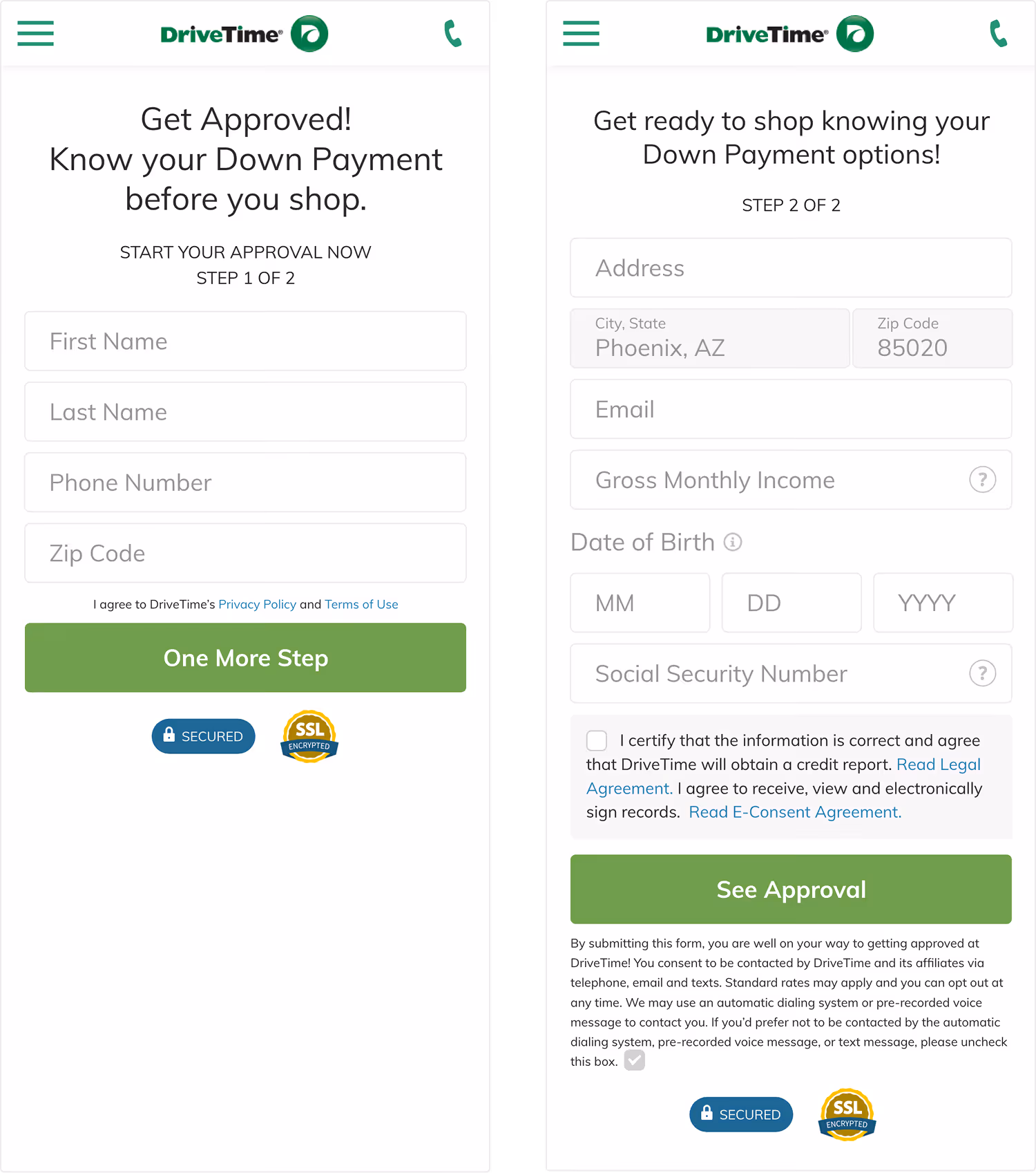
Building a better form
Research process and insights
Iterative experimentation: We ran some preliminary tests rearranging the form fields across the first and second page and discovered that moving the phone number field to the second page increased the total completion rate.
Conversations with customers: Feedback from our core customer was that they had often been rejected for financing elsewhere so our approval promise drove confidence. They were also concerned with receiving too many calls and emails.

Data takeaways: Diving into the current form data showed that customers who completed the first page of the form were highly likely to complete the second page. This told me that momentum might help carry the user through the form.
Competitive analysis: I looked at in and out-of-industry competitors that offered financing. Most businesses focused on conversational language and providing context to help inspire confidence with user as they moved through the form. LendingTree in particular inspired me to look into the single field per page form.

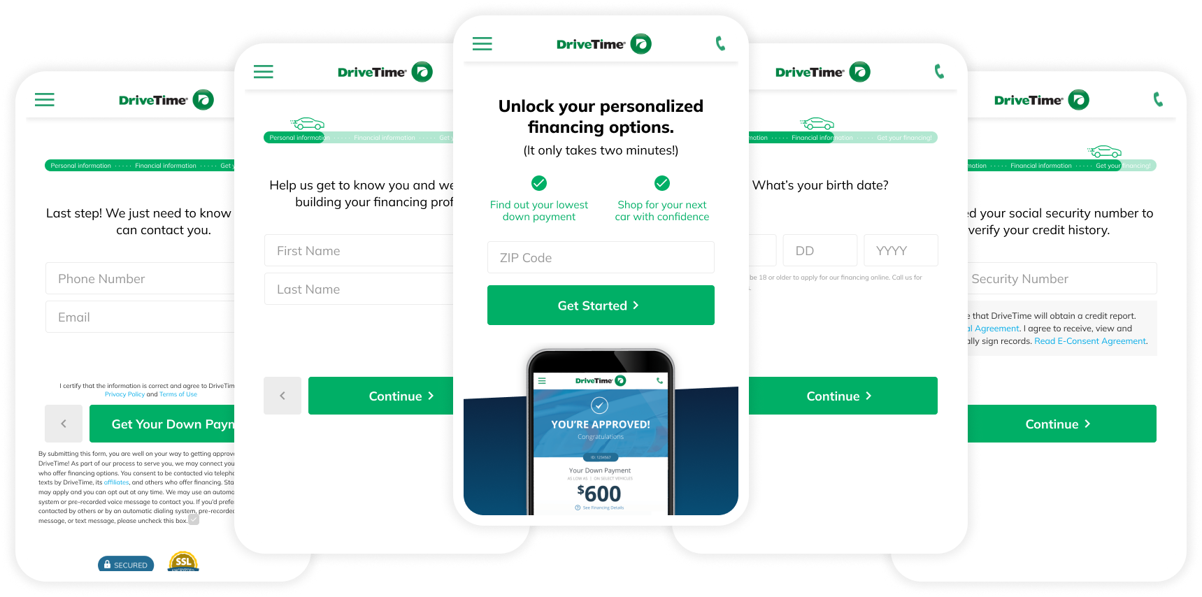
Solutions
Based on the research insights, I prioritized four key aspects in the new form design.
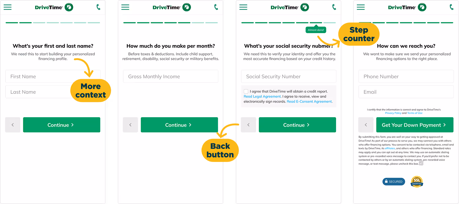
- Reorder the form fields: Prioritize low commitment questions first to build momentum
- Multivariate experiment: Find the best possible combination of UI elements and verbiage
- New form structure: One field per page approach
- Provide context: Content to help the user understand why we needed specific information
Final multivariate elements

Example prototypes
Results and next steps
The top performing variation of the new form increased completions by 1.3%, which unfortunately did not clear the 3.3% threshold we had set.
Key learnings that informed our approach to form design
- Drop-off points: The highest exit rates were the form entry page, second page (name), and Social Security Number. This supported our theory that momentum would help drive the user through the form, and that sensitive information like SSN drove more friction.
- Progress indicators: Providing a specific number of steps was more helpful to the user than a general progress indicator.
- Communication: The content that provided the most amount of information performed the best, reinforcing the competitive research.
